Misc
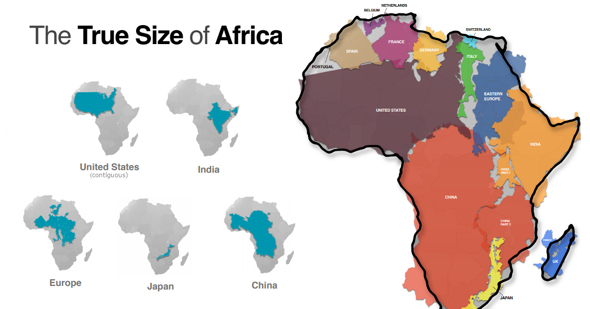
Mapped: Visualizing the True Size of Africa
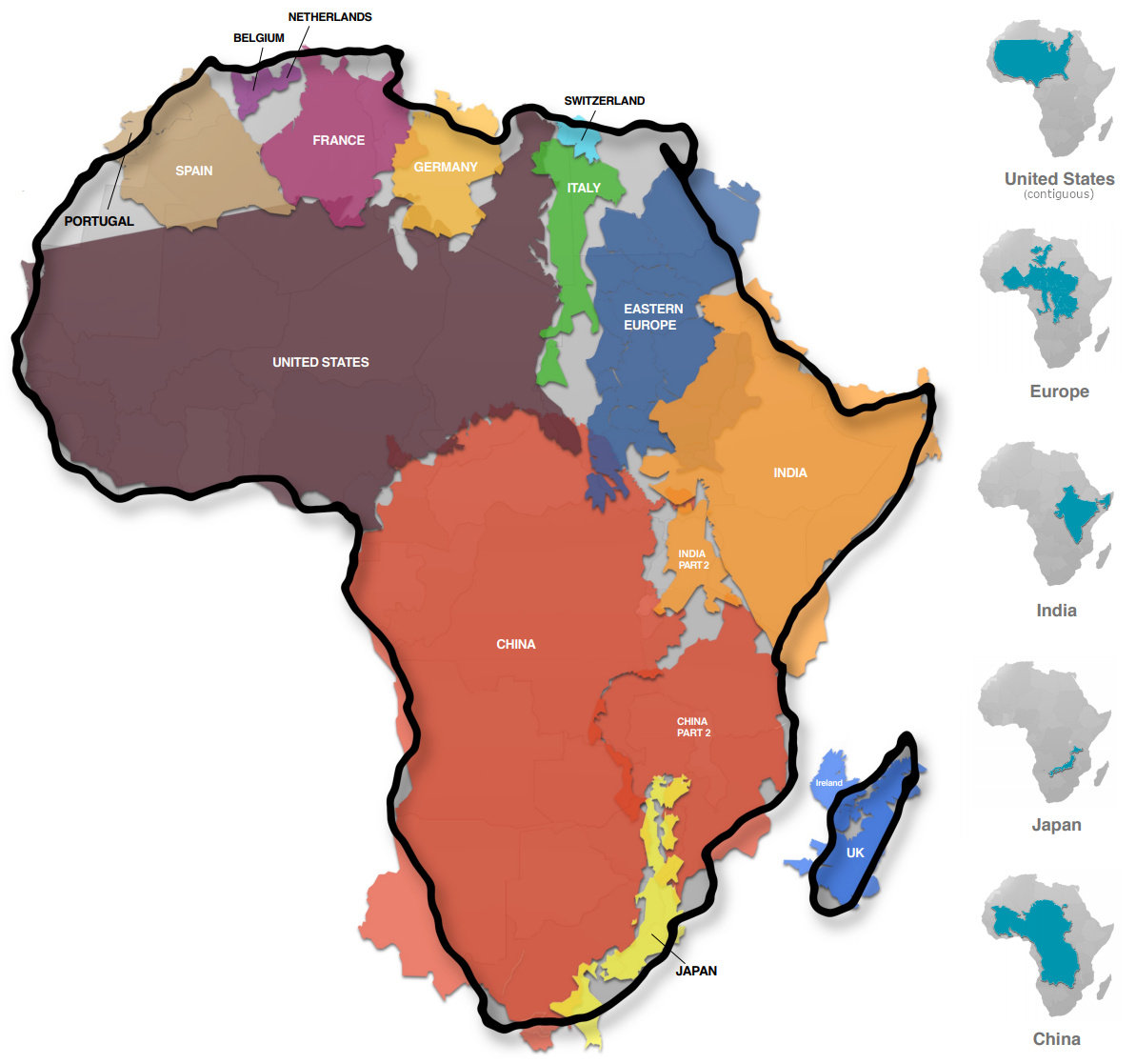
Mapped: The True Size of Africa
Take a look at any map, and it’s clear that the African continent is a big place.
However, despite the common perception that Africa is a large landmass, it’s still one that is vastly underestimated by most casual map viewers.
The reason for this is that the familiar Mercator map projection tends to distort our geographical view of the world in a crucial way — one that often leads to misconceptions about the relative sizes of both countries and continents.
A Geographical Jigsaw
Today’s infographic comes from Kai Krause and it shows the true size of Africa, as revealed by the borders of the countries that can fit within the continent’s shape.
The African continent has a land area of 30.37 million sq km (11.7 million sq mi) — enough to fit in the U.S., China, India, Japan, Mexico, and many European nations, combined.
| Country | Land Area (sq. km) | Land Area (sq. mi) | % of Africa |
|---|---|---|---|
| 🇺🇸 United States | 9.83 million | 3.80 million | 32.4% |
| 🇨🇳 China | 9.60 million | 3.71 million | 31.6% |
| 🇮🇳 India | 3.29 million | 1.27 million | 10.8% |
| 🇲🇽 Mexico | 1.96 million | 0.76 million | 6.5% |
| 🇵🇪 Peru | 1.29 million | 0.50 million | 4.2% |
| 🇫🇷 France | 0.64 million | 0.25 million | 2.1% |
| 🇪🇸 Spain | 0.51 million | 0.20 million | 1.7% |
| 🇵🇬 Papua New Guinea | 0.46 million | 0.18 million | 1.5% |
| 🇸🇪 Sweden | 0.45 million | 0.17 million | 1.5% |
| 🇯🇵 Japan | 0.38 million | 0.15 million | 1.3% |
| 🇩🇪 Germany | 0.36 million | 0.14 million | 1.2% |
| 🇳🇴 Norway | 0.32 million | 0.13 million | 1.1% |
| 🇮🇹 Italy | 0.30 million | 0.12 million | 1.0% |
| 🇳🇿 New Zealand | 0.27 million | 0.10 million | 0.9% |
| 🇬🇧 United Kingdom | 0.24 million | 0.09 million | 0.8% |
| 🇳🇵 Nepal | 0.15 million | 0.06 million | 0.5% |
| 🇧🇩 Bangladesh | 0.15 million | 0.06 million | 0.5% |
| 🇬🇷 Greece | 0.13 million | 0.05 million | 0.4% |
| Total | 30.33 million sq. km | 11.71 million sq. mi | 99.9% |
You could add together all of the landmasses above and they would not equate to the geographical footprint of Africa, which itself is home to 54 countries and 1.2 billion people.
Editor’s note: The above table is slightly different from the countries shown in the visualization, which focuses more on fitting recognizable country shapes into the geographical shape of Africa.
Why the Misconception?
Interestingly, the problem with maps is not that Africa is sized incorrectly.
Using the animation below, you’ll see that Africa is actually the most accurately sized continent using the common Mercator map projection:
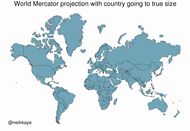
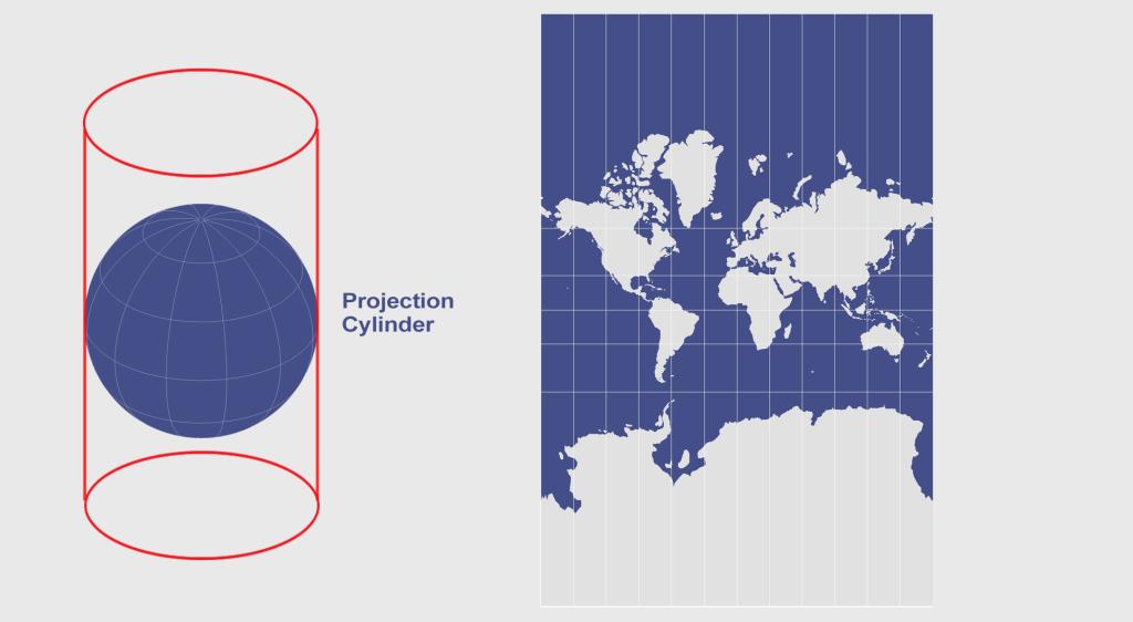
The Mercator projection attempts to place the spherical shape of the world onto a cylinder, causing areas closest to the poles to be “stretched”.
Africa, which straddles the Equator, barely changes in size — meanwhile, the countries furthest from the Equator become inflated from their true sizes on this type of map.
For those of us living in Western countries, this is an interesting dilemma to consider.
This means that the sizes of European and North American countries are distorted, giving us an inaccurate mental “measuring stick” for judging the relative sizes of other countries.
This has implications not only for Africa, but for the whole Southern Hemisphere: South America, India, the Middle East, and even Australia are “bigger” than they may initially appear on a map.


Misc
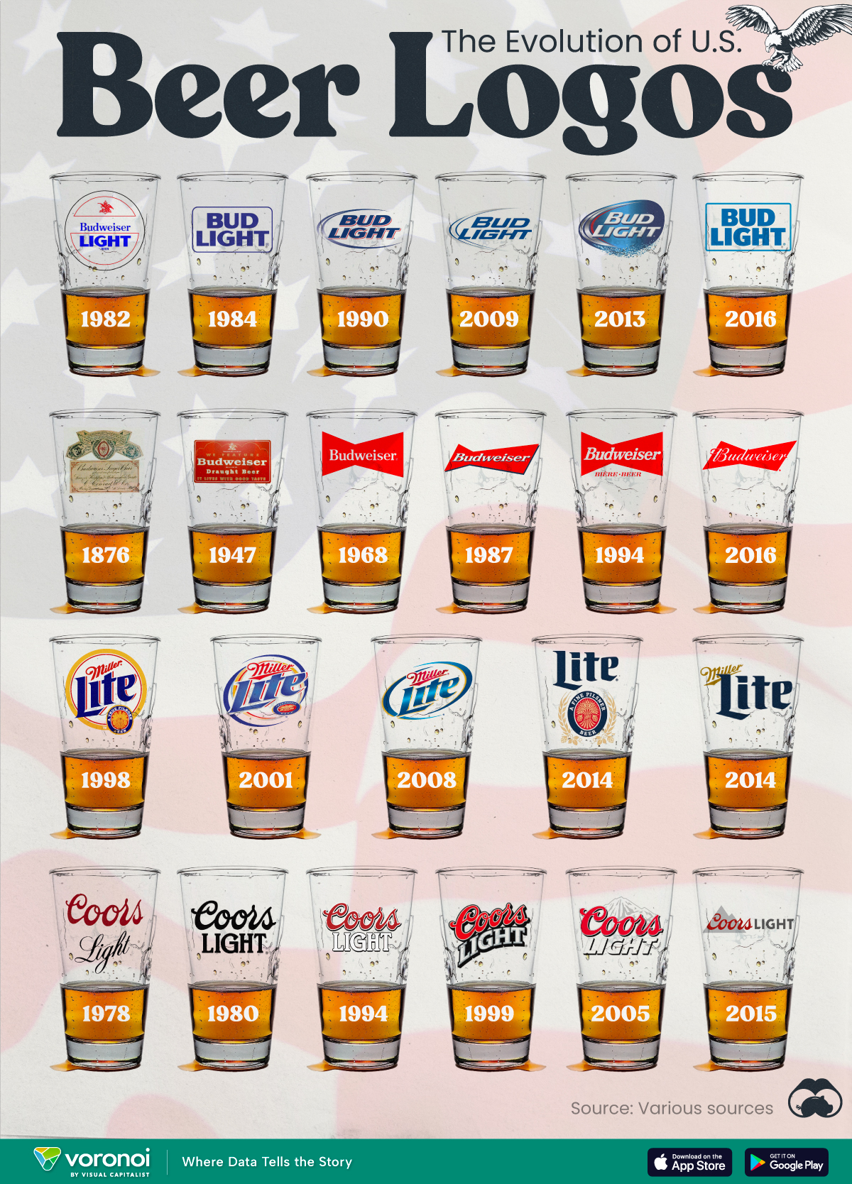
The Evolution of U.S. Beer Logos
In this graphic, we analyze the evolution of popular U.S. beer logos like Budweiser, Coors Light, Bud Light, and more.

The Evolution of U.S. Beer Logos
This was originally posted on our Voronoi app. Download the app for free on iOS or Android and discover incredible data-driven charts from a variety of trusted sources.
Despite selling a popular product, beer companies have to be creative to stand out in a competitive market.
In this graphic, we analyze the evolution of some U.S. beer logos based on various sources. We chose brands based on a mixture of criteria, including popularity (based on YouGov surveys), availability of logo assets, and those with interesting developments.
Bud Light Back to the ’80s
Despite recent backlash and calls for a boycott after sending a commemorative can to transgender influencer Dylan Mulvaney, Bud Light remains one of America’s best-selling beers.
The brand of light beer, owned by the Anheuser-Busch company, has switched from its more circular logo with italic letters adopted in the 1990s back to the Bud Light badge of the 1980s. It is composed of heavy uppercase lettering, written in two levels in a shade of blue with the inscription placed on a solid white background and enclosed in a thin rectangular frame.
Miller Lite Goes Old School
After following a similar approach to Bud Light’s branding throughout the 2000s, Miller Lite decided to undergo a major rebranding in 2014.
The company returned to its 1970s roots, once again combining a white can with its original blue, gold, and red logo. The redesign was largely considered a success, given that Miller Lite sales immediately increased following the change.
A Symbol of American Brewing
The oldest brand on our U.S. beer list, the Budweiser logo, has undergone more than 15 changes over the years.
The design of two connected triangles represents a red bow tie, as a symbol of American brewing.
The colors of the Budweiser logo include a vibrant red, which helps the logo stand out and be easily recognizable from a distance. Studies also suggest that the color red stimulates appetite. Meanwhile, the white inscription symbolizes purity and cleanliness.
Curious to learn more about the beer market? Check out this graphic about global beer consumption.

-

 Markets6 days ago
Visualized: Interest Rate Forecasts for Advanced Economies
-

 Markets2 weeks ago
Economic Growth Forecasts for G7 and BRICS Countries in 2024
-

 Wealth2 weeks ago
Charted: Which City Has the Most Billionaires in 2024?
-

 Technology2 weeks ago
All of the Grants Given by the U.S. CHIPS Act
-

 Green2 weeks ago
The Carbon Footprint of Major Travel Methods
-

 United States1 week ago
Visualizing the Most Common Pets in the U.S.
-

 Culture1 week ago
The World’s Top Media Franchises by All-Time Revenue
-

 voronoi1 week ago
Best Visualizations of April on the Voronoi App